LEGION REBRAND
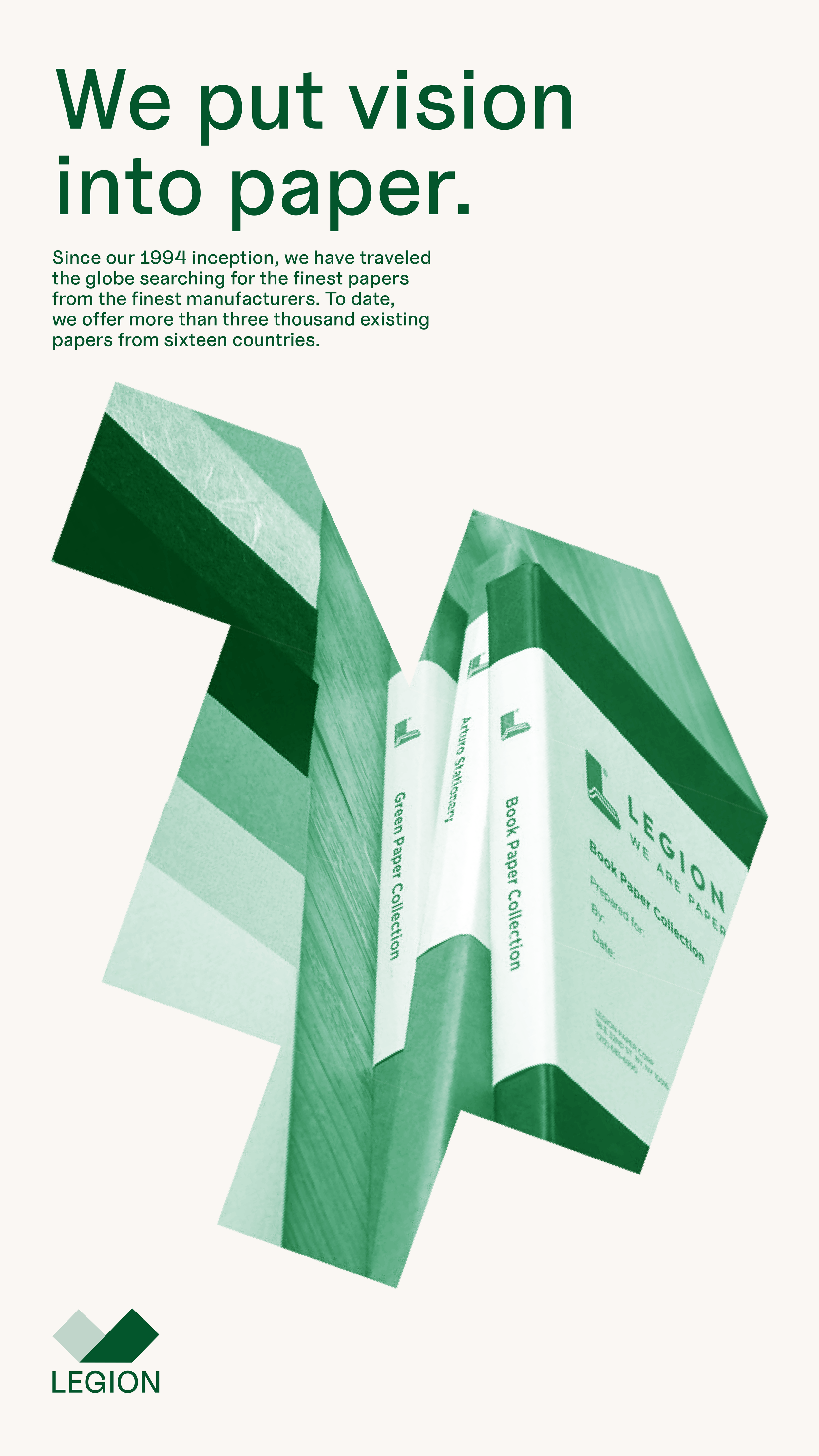
My central mission for a hypothetical Legion Paper rebrand was to convey the brand's desire to centralize artists and creative voices. By aiming for a bold, crafty, playful tone, I developed an identity that speaks to that group of people first, emphasizing the usage of paper as both a tool and a medium for creative expression.
The most unique part of this rebrand is the versatility of its logo form. It breathes life into Legion through its usage both as part of a packaging pattern and as a modular unit for image treatment. Uncut Sans by Kasper Nordkvist was chosen as the primary typeface for Legion due to the way that some letters evoking cut paper shapes.
This page is under construction.
Please check back soon for more detailed documentation!


